summary
Visual identity. The collection of all visual elements, such as logos, color palettes, typography, and imagery that make 55% of brand first impressions. It plays a vital role in shaping audience perception and engagement. The benefits? A well-designed visual identity can increase brand recognition, loyalty, and sales.
But what makes a good visual identity in the first place? Some vital features include suitability for your target audience, timeliness, and distinctiveness. Remember that a compelling visual identity should be easily recognizable, simple to understand, and adaptable across different media.
Dive into this must-read article with real-life examples from top brands like Boxed Water, Apple, and Stella Artois. Discover how these brands master differentiation, relatability, loyalty, and consistency, and how you can do that, too!
Visual identity can make or break the deal. It goes far beyond simply choosing your brand colors and creating a logo. It embraces the whole multidimensional visual representation of your brand, values, and mission. Visual identity shapes the audience’s perception of your business and determines if and how the viewers will engage and communicate with you.
Since more than half of brand first impressions are visual, it’s vital to create a strong and compelling visual identity that speaks to your values and resonates with your target audience. To help you get off on the right foot, we’ve compiled the fundamental information about visual identity and its importance.
You’ll learn the multiple benefits it can bring to your business and the essential elements it encompasses. And finally, you’ll find some outstanding branding identity examples to inspire you on your journey to the best visual self of your company.
Grab your coffee, and let’s dive right into the exciting topic of dressing your brand in shapes, colors, and fonts.
What Is Visual Identity?
Visual identity is the collection of all the various visual elements representing a brand and differentiating it from all other businesses and organizations. It encompasses every aspect and detail of the brand personality creating a recognizable and cohesive brand image that a visitor can actually see. This includes everything from logos, color palettes, typography, and imagery that build the company’s website to the interior of the physical offices and stores.
Visual identity is an embodiment of a brand's personality, values, and mission. It must serve three fundamental purposes:
Representing what the brand stands for in a compelling and consistent way across all channels
Illustrating the company’s products and services as the best solution to the visitor’s problems
Building a lasting emotional connection and trust with viewers through visuals that resonate with them
So, visual identity can impact a company’s overall success by shaping the target audience’s perception of the brand. That’s why businesses usually develop a brand style guide specifying the company’s visual branding and ensuring consistency. When done right, effective visual identity design creates a unique and memorable brand image, which can help increase brand recognition, loyalty, and sales.
Visual Identity, Brand, and Branding: What Are The Main Differences?
It can be difficult to distinguish between the three concepts of brand identity, branding, and visual identity. As similar as they may sound due to the common spectrum to which they belong, it’s essential to understand the differences between them. Here are some helpful cues.
What Is the Difference Between Branding and Visual Identity?
The main difference between branding and visual identity is that branding refers to the entire strategy and management efforts beyond the logo and visual identity. It involves the development of a concept, strategy, and planning to create a cohesive and consistent brand image.
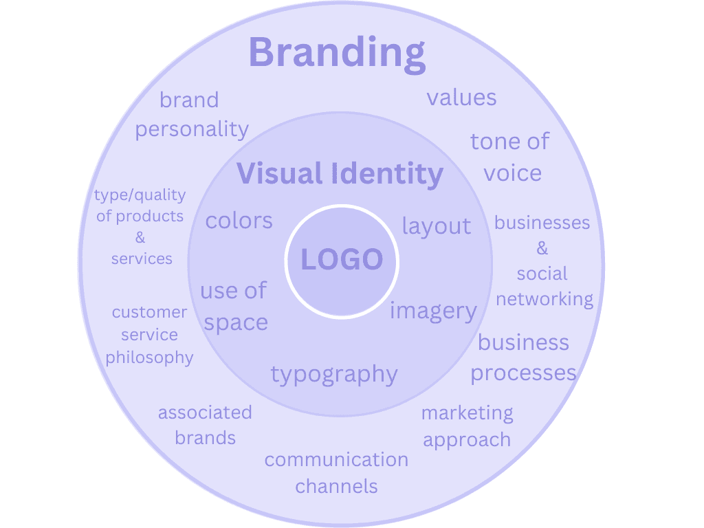
The differences between branding and visual identity
On the other hand, visual identity is a subset of branding, which focuses on graphic elements such as the logo, color palette, typography, and other visual elements that represent the brand. It is an essential part of branding, as it communicates the brand's personality, values, and attributes to the audience.
What Is the Difference Between Brand Identity and Visual Identity?
Visual identity is part of brand identity but focuses on what people see and recognize about your brand.

The differences between brand identity and visual identity
As for brand identity, this is your company's overall personality, encompassing all brand elements. It includes values, mission, tone and voice, style guides, brand persona, unique assets, visual assets, and more. Think of it as the feeling that customers associate with your brand.
Elements of a Good Visual Identity
If you want to learn how to build a robust brand visual identity, you need to know what principal elements you have to consider. The main elements of visual identity are the brand logo, color palette, typography, photography, images, and the company’s website. Let’s discuss each of them in more detail.
Logo
A logo is a visual symbol or mark that represents a company, organization, product, or brand. Its purpose is to establish a direct association with the brand. Typically, it’s simple and consists of a unique design, shape, or typography that is easily recognizable and memorable.
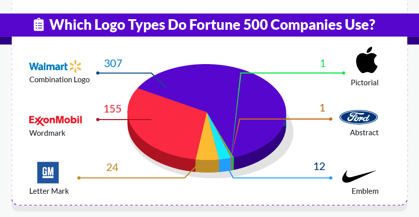
A recent study of the Fortune 500 logos identified seven types of logo designs depending on the elements they contain, which are combination logos, wordmarks, letter marks, emblems, abstract icons, and pictorial icons.
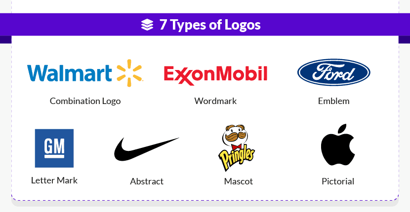
The research established the dominance of combination logos accounting for 307 out of all 500 logos.
The study also found that a colored logo can boost your brand recognition by up to 80%. What’s more, blue and black, both standing for competence, are the two top colors used in two-thirds of all the five hundred logos examined.
Nowadays, logos are everywhere. You can see them in corporate environments and everyday life. Logos are often used in various forms of media, such as business cards, websites, signage, packaging, and advertising materials, to create brand recognition and promote brand loyalty.
However, a pixelated, distorted, or too-small-to-read logo can have a negative impact on brand perception. That's why keeping a high-quality digital copy of your logo is essential. This will ensure you're ready for any situation, whether a small printing job or a larger project.
Brand colors
Brand colors refer to the specific set of colors a company uses consistently across all its branding and marketing materials. Good brand colors are unique and memorable and should speak to your brand identity, values, and personality. They are an essential part of creating:
Logo Design
Marketing Materials
Packaging
Website Design
Brand colors include the company's signature color and additional colors to complement the main color and create a cohesive color palette.
Companies may also have specific guidelines for their brand colors, including color combinations, typography, and other design elements. Why?
A well-defined brand color is vital for several reasons:
Brand Recognition: Consistently using the same colors in all marketing materials helps customers recognize and remember your brand. A study shows that brand color improves recognition by 80%. Moreover, brand color is the primary focus for 93% of buyers when purchasing a product.
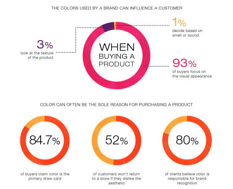
Differentiation: A unique and recognizable color can set your brand apart from competitors. Did you know that people form a subconscious judgment within the first 90 seconds of viewing your product? And between 62% and 90% of that assessment is based solely on the product's color.
Emotional Connection: Colors can evoke emotions and associations, so choosing the right color(s) can help build a relationship between your brand and audience.
Most companies typically incorporate their primary brand colors directly from their logo. Including additional colors can help expand the brand's color palette and further define the brand's personality and style.
It's crucial to avoid common mistakes, such as using clashing colors or selecting dominant colors for the background, as in the example below.

For instance, you may love vibrant colors and think they’d perfectly go with your website content. However, they will dominate the copy and the images, distracting the attention from what you have to say and show, which will reduce the overall impact of your branding and marketing efforts.
It's also essential to include neutral colors in your palette, such as black, gray, white, or off-white. Doing so will allow your brand colors to stand out and make a more significant impact.
Typography
Typography is the design and arrangement of text, including fonts, sizes, spacing, and other visual elements. Good typography supports and enhances the impact of your message and helps you create a consistent and recognizable visual identity. Typography is an important aspect of:
Logo Design, which is crucial for establishing visual identity and brand recognition.
Print Materials, which include everything from business cards, brochures, and product packaging to outdoor advertising, billboards, and signage.
Digital Media like websites, mobile applications, and social media channels.
Companies typically use two to three fonts for everyday communication. And the most popular font they use? The WebsitePlanet’s study cited above shows that 73% of famous brands use sans serif. As the example below shows, McDonald’s do a really great job at boosting brand recognition through effective and consistent typography.

So, good brand typography ensures that all communications, including marketing materials, product packaging, and websites, are visually consistent and in line with your brand's values and personality. This helps establish brand recognition, build customer trust, and differentiate your brand from competitors.
Photography
Have you heard the saying, "A picture is worth a thousand words"? Your visual content offers an incredible opportunity to tell your brand's story and reinforce your visual branding identity.
Brand photography is a collection of images representing your brand's values, personality, and identity. They can feature your products, team, workspace, and other relevant aspects of your business. Letting your audience take a peek at your behind-the-scene company life is an excellent way of humanizing your brand, making it relatable, and building a deeper relationship with the viewer.

Photography for ClickGUARD - one of our tech clients
Images should blend perfectly with the rest of your brand's features, such as color schemes, logos, and messaging. Utilizing photography in this way offers several benefits.
Creating a Consistent Visual Identity: Brand photography creates a consistent look and feel for your brand, making it more recognizable and memorable. Also, high-quality and professional photography indicates that your business is detail-oriented, consistent, professional, and result-driven.
Building Trust and Credibility: It’s long established that it only takes 50 milliseconds for people to form a first impression. Thus, authentic brand photography helps build trust and credibility with customers by showing real people and products.
Increasing Engagement: Did you know that 65% of business executives admit that photography, illustrations, and videos are vital to communicating your brand story? Moreover, Facebook posts with images contributed to 87% of all engagements on brand pages.
When selecting imagery for assets such as your website or social media posts, it’s vital to ensure they are visually consistent. This requires paying attention to the style, composition, and subjects featured in the photos.
Including internal headshots, lifestyle/portfolio images, product photos/videos, social media post photos, and stock photos/videos also helps strengthen your visual identity and create a powerful impression on your audience.
Graphics, Illustrations, and Icons
Icons, buttons, graphics, and illustrations are other visual elements crucial for creating a unique and consistent brand visual identity across all platforms. You can use them to convey information, ideas, and emotions to your target audience. Microsoft Azure are doing an excellent job using consistent icons and graphics on their website.

Also, visual elements can enhance the user experience and give a human feel to your brand. When used in the right context, for example, hand-written illustrations add a touch of authenticity and individuality, differentiating you from all other players in your niche. So, it’s essential to avoid generic or staged images and choose ones representing your genuine brand's perspective.
Your Website and Online Presence
Your website, social media page, and email help create your online presence and allow customers to interact with your brand online and visually see what your company stands for and offers. It's where they learn more about your brand, products, and services.
Thus, your website design should reflect your company's visual identity. This means the colors, fonts, and overall design should be consistent with the branding guidelines. Look at the outstanding combination of imagery, color palette, typography, and product photography integrated by Apple on their website.

On the other hand, an online presence includes social media profiles, online ads, and other digital marketing efforts. These channels should also be consistent with your company's visual identity. For example, if a company's logo is blue and green, its social media profile and ads should also incorporate these colors.
Keep in mind that customers are more likely to trust and do business with a company with a solid and consistent visual identity across all channels. This is where a professional website and digital platforms service can be a particularly valuable helping hand relieving you from the tedious job of juggling a website, multiple social media profiles, and email campaigns.
What Is The Importance Of Visual Identity For A Brand?
Differentiation
Visual identity creates the visual representation of your company that sets you apart from competitors. When customers see elements of your brand visual identity, they should be able to identify them as standing for your brand and products, differentiating you from the other businesses in the market.
For example, the Boxed Water company has built a consistent image in line with their values and mission.

The company focuses on minimizing plastic and aluminum waste by providing a sustainable option. Their visually appealing product design also communicates their message and further promotes the brand values. It significantly differs from all other products, which makes it easy to recognize and relate to the brand.
Relatability
A visual identity that is clear, easy to understand, and speaks directly to your brand values helps your audiences readily identify the common principles and beliefs and resonate with them. This connects you with consumers on a personal level. It allows them to recognize your brand and relate to it, which builds brand loyalty and drives sales.

Take the Boxed Water example above. They make their values and mission absolutely clear, transparent, and straightforward throughout their whole website and social media profiles, featuring a lot of user-generated content, making their customers heroes in their own story.

This enables visitors to instantly see a reflection of their values and relate to the brand. Thus, creating a visual identity that aligns with your brand identity can help establish a strong connection between you and your customers.
Loyalty
Consumers tend to trust and rely on brands they know and understand. Did you know that 84% of customers are likely to remain loyal to a brand whose values align with theirs?
A well-crafted visual identity helps customers visualize and understand what your brand stands for. It infuses confidence and dependability, enabling them to connect deeply with your brand.
Consistency
A strong and consistent visual identity is crucial for creating a brand image that keeps customers engaged and satisfied. It helps you establish a reliable customer experience that fosters brand loyalty.
Moreover, maintaining a consistent visual identity is key to the long-term growth of your brand. As your brand develops over time, a recognizable visual identity provides a foundation of familiarity, reducing confusion and enhancing brand recognition.
A notable (and notorious) example is Tropicana's packaging redesign. It failed to resonate with its existing customers, which led to customer alienation due to the lack of recognition.
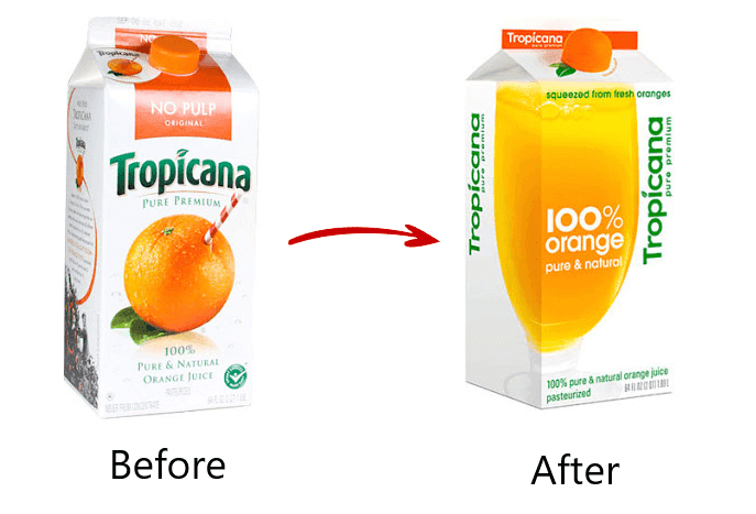
Remember that consistent visual identity aims to let your consumers easily recognize your product and choose it over competitors. By doing so, you can establish a connection with your target audience, increase brand awareness, and ultimately achieve long-term success in your industry.
What Is a Good Visual Identity?
A strong visual identity empowers a company to highlight and convey a clear message about its values, purpose, and mission, shaping the audience’s perception of the brand. What are the features of an effective visual identity?
Suitability
A good visual branding identity is well-suited to your target audience, evokes the desired emotions, and is appropriate for the intended purpose or situation. So, it’s based on the answer to the fundamental questions: What is your target audience? What are their pain points, aspirations, and needs? How can you respond to these needs through consistent and recognizable visual elements?
Timeliness
A strong visual identity is both timely and timeless. It evolves with a brand to stay relevant over time. Look at the evolution of Apple’s logo, which has followed the current trends and demands ever since its foundation in 1976.

Another impressive example is the timeless logo design of Stella Artois which was created as far back as 1366 and has been used for almost seven centuries now.

Therefore, a good visual identity should be flexible and adaptable while maintaining consistency and recognition.
Distinctiveness
A distinctive visual identity sets your brand apart from competitors and leaves a lasting impression on consumers. It’s easily recognizable and memorable, enhancing brand awareness and loyalty.
Simplicity
Simplicity is key to a successful visual identity. It promotes clarity and understanding for consumers, ultimately making a brand easy to remember and recognize. Note that simplicity and clarity are the foundation of a great visual identity design.
Functionality
A strong visual branding identity should be highly functional. It should be able to adapt and reproduce seamlessly across different media, including digital, print, and physical environments.
3 Examples of Outstanding Visual Identity Design
To illustrate what a good visual identity is and give you some additional inspiring ideas, we’ve collected some branding identity examples.
SOLO Accounting
SOLO is a fully digital subscription-based accounting start-up service for freelancers.
Their collaboration with a professional creative digital agency resulted in the creation of a modern playful design based on the company’s color palette, typography, and images. The business has chosen to brand itself with yellow – the color of sincerity and excitement. It provides a great background for the wordmark logo and makes the text in black easy to read and understand.

SOLO Website - One of our tech clients
The professionally designed visual identity runs consistently on the company’s website and mobile app.

The outcomes are impressive – within only five months after its launch, SOLO reached almost 2,000 monthly subscribers and is gaining new ones daily.
Airbnb
Airbnb is a prime example of a successful brand identity. They have a lovable logo, an easy-to-use interface, and authentic messaging. The brand started with a simple concept in 2008. Since then, it has evolved into a game-changer in the hospitality industry, focusing on a sense of belonging.

Their 2017 rebrand included a new abstract logo and a complete website and mobile platform redesign, which resulted in a community-driven experience. With tons of user-generated content and high-quality, stunning images, Airbnb makes all consumers feel part of a shared journey.

So, the main takeaway from Airbnb's example is their commitment to attentive listening to their users. This approach sparked their development and resulted in a more relatable, authentic, and thriving brand.
PayPal
Another outstanding example of visual identity is PayPal. The brand's initial identity, created during the desktop web 1.0 era, no longer suited its growing stature and needed a comprehensive visual review.
PayPal recognized the need to address key brand challenges. One of those challenges was standing out in the highly competitive market. Thus the brand created a new visual identity that captures the brand's spirit of connection and transition.

The new design features a modern, bold, and youthful logo comprising two elements: the double P "monogram" and the PayPal word in italics. The double P monogram represents the brand's ability to pay for multi-country applications. It implies a sense of connection and coming together. The PayPal word in italics represents the brand's forward-thinking and never settling attitude towards the future.

Moreover, PayPal retained the blue color, representing trustworthiness, competence, and reliability. They also updated the font to a classic sans-serif typeface, improving legibility and making it sharp, modern, friendly, and approachable.
Time to Craft Your Own Visual Identity
A good visual identity is the collection of all visual elements blended together to represent what your brand stands for, illustrate your products or services, and build trust and loyalty with your viewers. It will help you stand out in the competitive market and attract audiences who share your values and beliefs. These are the prospects that will engage with your brand and can ultimately become your customers.
The key elements of a good visual identity include a strong brand logo, a unique and memorable color palette, consistent and recognizable typography, high-quality brand photography, and functional graphics, illustrations, and icons. To build a good visual identity, you have to make sure it’s suitable for your target audience, timely, and timeless. Your visual representation should also be distinctive, simple, and functional.
Taking care of all these aspects will enable you to create a visual branding identity that resonates with your target audiences and builds a lasting emotional connection with them. Ready to get down to crafting all visual elements that will constitute your brand? Wait no more and start your journey to a visually stronger and more impressive identity. And if you don’t want to grind away on your own, a professional creative digital service can be your best companion.
Author
Adelina
Co-Founder & Brand Strategist


